It takes a few seconds for recruiters to evaluate a candidate. (see the study) And what do you think will attract the attention for the first seconds? Of course, this is the format of your resume, its style and length. Therefore, your task here is to maintain balance.
2. have good font to read it
3. highlight key sides
4. not exceed 1-2 pages
5. not be overloaded with unnecessary information
In this article, we’ll take you through:
- What are the resume formats
- What style of resume to choose
- What font to use
- Optimal resume length
- Frequent mistakes in design
As we began by mentioning how recruiters judge a curriculum vitae in the few first seconds, it’s also important to mention that the human eye is able to capture a complete image of what it’s looking at, before honing in on the most attractive and important parts of it. This psychological trick works in a similar way with text as well.
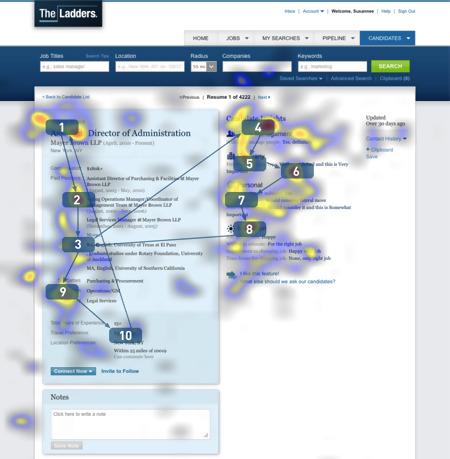
As can be seen from the above image, the top three sections at which a recruiter pays most attention include job position, work experience and education. In the first few seconds, how these sections are formatted demonstrate the style, accuracy and conciseness of a resume.
1. How to Design Resume
In the process of job searching, you can choose one of three common resume formats. They create the first impression and determine how recruiters and hiring managers consider your candidacy.
There are 3 main resume formats :
- Chronological
- Functional
- Mixed
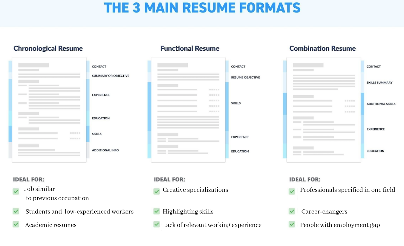
Let’s talk in more detail which resume format would be the best in which case:
Chronological Resume
A chronological resume is the most frequently used resume format. It shows the candidate’s experience in reverse chronological order, that is, from the candidate’s most recent, or even current, job position, to their very first. This format is usually the first that comes to mind when most people sit down to write a resume, and is probably how they were taught to construct one in school or university.
Chronological resume format includes the following sections:
1. Contact Information
2. Summary
3. Work Experience
4. Skills
5. Education
6. Certificates
7. About
Tip 1: Most recruiters and HR personnel consider a chronological resume as the best resume format.
Functional Resume
A functional resume is the best resume format for those who want to focus on and highlight their skills. It’s best used in the event of a gap in employment, not having a job for a while or taking time off, for instance, or a lack of relevant work experience for the desired position.
Functional resume sections include:
1. Contact Information
2. Summary
3. Skills
4. Education
5. Work Experience
6. Certificates
7. About
In this resume format, the important objective is to list your skills in detail and explain why they’re an excellent fit for the vacant position you’re applying for.
Mixed Resume
A mixed resume combines elements of the chronological and functional resume formats. Although this blended format also emphasizes skills, detailing both hard and soft skills, the education and work experience sections are also highlighted, as they are important to recruiters.
Mixed resume sections include:
1. Contact Information
2. Summary
3. Skills
4. Work Experience
5. Education
6. Certificates
7. About
Tip 2: Use numbered and bullet lists to detail your skills and experience.
Resume Formatting for Application Tracking Systems (ATS)
A few words about ATS. Applicant tracking system is an automatic candidate selection system. It helps recruiters use text recognition to filter candidates according to specified criteria and keywords from the resume. Many large employers use ATS systems to filter out resumes for relevant vacancies before moving on to the candidate himself.
We mention it because in the real life a majority of ATS systems are imperfect. There is not all resume formats can be correctly recognized by it. So, the system does not recognize pictures, graphics, therefore resumes in .jpeg format will be automatically missed. ATS of course does not recognize infographic. In addition, text elements in the format of column or tables may not be perceived by it. To get an idea of how the robot will read your resume, try copying it into the Word: in this order it will be most likely recognized. So consider this when submitting to a large company.
2. Resume Design
A resume’s design should demonstrate your familiarity with an industry’s, or a company’s, distinctive spirit and corporate culture. In other words, it should show that you’ve done your research and homework about the company you’re applying to. What’s more, subconsciously, it forms an initial impression about you. Below, we’ll discuss it in more detail and how you can use resume styling to your advantage:
Classic Resume Design (in our resume builder, this is the Basic template):
The main requirements for this style are simplicity, accuracy, and logical structure (a chronological summary). In general, everything should be there for a reasons and there should be nothing superfluous. This resume style is a universal option for many professions, as most candidates, such as industrial workers, office and administrative staff, etc, can use it to great effect. For our builder this one is a free resume format.
Resume with Infographics (in our resume builder, this is the Smart template):
This resume format has specific objectives:
- To Get Noticed. As it’s different, it successfully stands out from a stack of standard resumes. This is particularly useful where the competition for a job position may be fierce (sales managers, for instance)
- To Highlight Skills. Infographics are a very convenient way of indicating your level of special or common skills – so-called ‘soft skills’(This is especially useful in the IT field).
- To Position Yourself. A resume with infographics shows a candidate’s vigor, unconventional approach to work, and, confidence. (This is favorable in communication-based professions, like sales, and the PR sector).
Strict Corporate Resume Design (in our resume builder, this is the Professional template):
This is the best resume style for:
(a) Candidates with a lot of work experience: When your extensive experience speaks for itself and there is no need, or it would be out of character, for flamboyant presentation (manager, senior manager, tech).
(b) Corporate employees (lawyers, financiers, auditors): In general, when a meeting requires a suit and tie, there is a number of unspoken agreements are made and a strict business approach is expected.
Minimalistic Resume Design (in our resume builder, this is the Simple template):
An emerging trend in recent years is that of minimalism; the idea of ‘genius and beauty in simplicity’
We created this template for those who find a resume with infographics overbearing, but in the absence of solid, relevant experience, a classic or strict resume would look empty and feel lacking. Therefore, there is a deliberate allocation of space for skills, languages, certificates, etc, but without the bright colors and bells and whistles. Usually, this resume style is preferred by candidates with up to 3 years’ experience, for whom a one-page summary would the best option.
Alignment and Margins in Resumes
Margins also have a place in eye-pleasing resume design. Use margins of 0.5 – 1 cm on the sides of the text, while using 2 cm above and below. Fortunately, this is standard formatting, which is difficult to get wrong.
Smaller, 0.5 cm margins make summaries look aesthetically unattractive and cramped, while those larger than 1 cm give a sense of your resume containing little information.
Your name and contact information should be centered, while alignment of headings, bullet lists, etc should be on the left. This is explained by the fact that most people in the West read the text from left to right so such formatting is convenient for a recruiter to understand.
Tip 3: Use bold and italics if necessary, but avoid underlining when writing a resume. It’s been repeatedly shown that underlined text is difficult to understand for readers. Therefore, you want the recruiter to perceive all the information you’ve provided as well as possible.
3. Fonts for Resume
This may be hard to believe but recruiters actually place a lot of importance on a candidate’s choice of font.
Riley Kundtz, HR at HubSpot, says “I find classic formatting and Times New Roman font to be helpful when reading a dense resume from an experienced MBA candidate.”
Each recruiter has their own opinion about fonts, but they all agree that curling fonts are not welcome in a candidates’ application.
Your choice of font depends on personal preferences, but avoid decorative fonts with a complicated calligraphic design. They’re more difficult to understand and may be displayed differently on other computers than on your own – or nor displayed at all!
There are two categories of fonts: serif and sans-serif.
First one includes: Times New Roman, Garamond, Georgia
Second one includes: Arial, Geneva, Helvetica
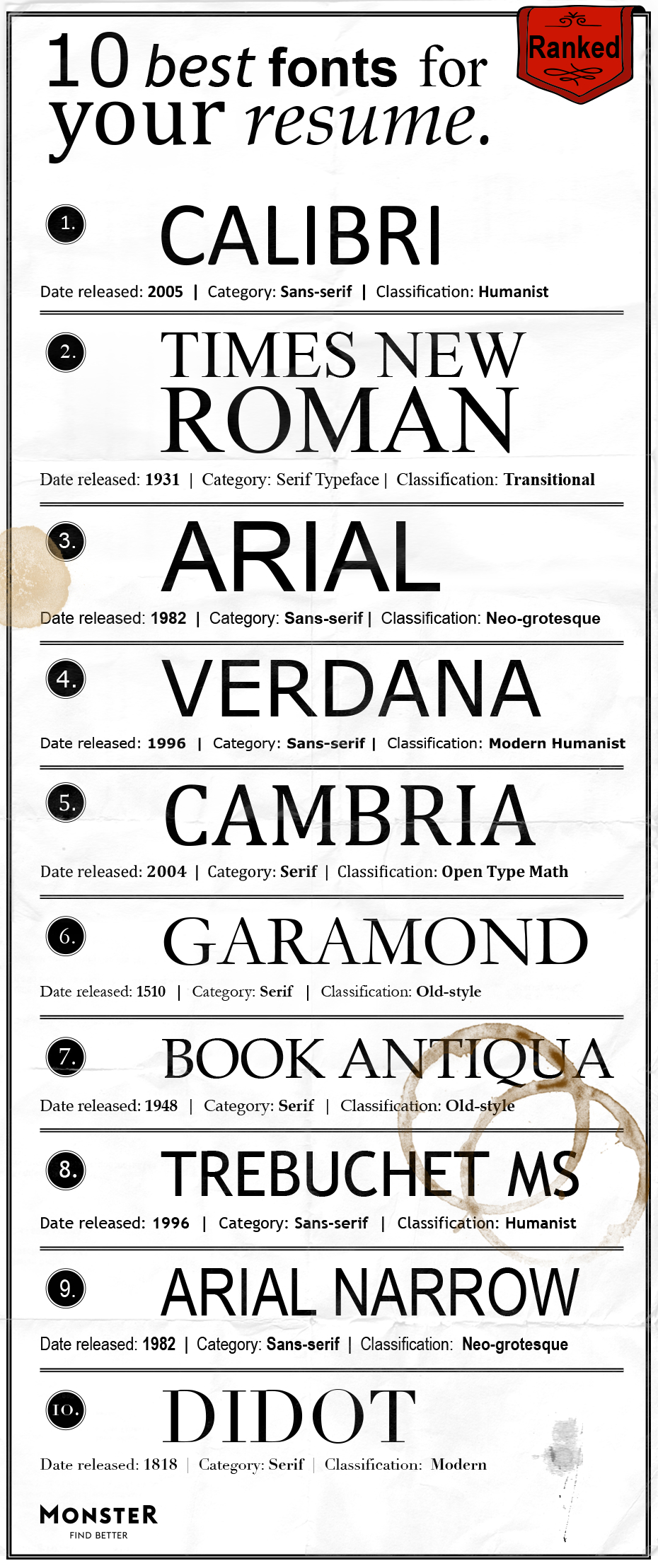
Here’s what Monster, the world’s largest employment portal, writes about the top 10 resume fonts:
1. Calibri
Soft, gentle and modern, this is the default font of many email programs, so it’s familiar to the eye—and it’s a safe sans serif font.
2. Times New Roman
“For legal, operations and corporate jobs, this formal serif font is still readable electronically and goes with the brick-and-mortar feel of those industries,” says Augustine.
3. Arial
This classic sans serif font “is a great choice for creative people or those in a marketing field,” according to Augustine.
4. Verdana
Like Arial, this is another clean and modern font that’s even easier to read because of the slightly wider spacing.
5. Cambria
This is another default-type font that recruiters are familiar with, so you can’t go too wrong with it. It’s not as formal as Times New Roman, but it’s just as dependable.
6. Garamond
More graceful than some of its sans serif friends, Garamond might suit artistic types more than bankers or executives.
7. Book Antiqua
As its name suggests, Book Antiqua would work well for professions in the arts or humanities.
8. Trebuchet MS
Friendly and round, this is probably a good choice for creative or marketing fields.
9. Arial Narrow
If you’re tight on space, this sans serif is modern and still legible even in its narrow form.
10. Didot
This has style and panache, yet it is still readable. It’s probably the most artistic font that’s still professional enough to use on your resume.
We spent a lot of time choosing fonts for our constructor (after all, they need to look perfectly in Cyrillic as well). As a result, we tried to select 6 stylistically different, but at the same time convenient to read fonts.
| Serif | Sans serif | |
| Cambria Garamond Minion Pro Myriad Pro | Helvetica Roboto |
Tip 4: Please note that in most cases your resume will be viewed on the screen. (Moreover, it’s not a fact that with a good resolution, may be even from a mobile one). And in such cases, sans-serif fonts look much nicer.
Font size: 11-14 pt. This size range looks good with many fonts, but you can experiment what looks better with your font preference.
Larger font size don’t create the desired impression, as bigger letters are less elegant, and can even border on repulsive.
While we’re on the subject of big letters, though new sentences and paragraphs should begin with a capital letter, not even the most important details should not be written in all caps.
The size of headings are recommended to be 2 pts larger than your main text. For instance, your name, the desired job title, and the section title of the summary may be 14 pt, written in bold, while the rest of the text is 12 pt. This means you’re highlighting the basic information while visually enhancing your resume.
Font color: Black, as the main color. Your choice of color should place focus on the information, not on the color itself. You can choose a color like orange or blue for the headers, as they should draw the most attention.
It is common for different professions to choose a particular color, especially if there is a desire to show a creative side. For example, designers and creative professionals often choose green as their main color, while blue is well suited for candidates applying for corporate positions.
It is best to avoid:
- Pink
- Yellow
A few more important tips when choosing font color:
- Stick to neutral matte colors, instead of neon colors that merge into the background.
- Do not use more than 3 colors for the font; simple and classic resumes are always welcome.[/su_box]
4. Resume Length
The question of length is often difficult to answer. However, to be safe, stick to the rule of the one-page resume.
Two or three pages are suitable in the case of 10+ years of experience in a particular area. If this option suits you, then concentrate on double-checking whether all pages of your resume are sent to your potential employer. However, if you have less experience or want to keep it concise, a one-page resume is also acceptable. Regardless of the length, be sure to proofread and ensure that all pages are included when submitting your application to avoid any missing or incomplete information.
In an interview, an HR specialist at Google shared that one of the main reasons a resume is being rejected is because of its design. During his entire career, the recruiter reviewed over 20,000 of them and spoke about his observations. Among them, Laszlo Bock recalled:
1. A good rule is one page for every 10 years of work. No one is going to read a three or four-page resume. A description of your work experience will essentially show your ability to synthesize an excessive amount of information.
2. If you are not applying for a job as a designer or artist, your focus should be on ensuring that the document is neat and readable and typed in a font of at least 10pt.
A one-page resume looks neat and contains all the important and useful information about a candidate. Another reason to write a short resume is that you avoid the additional pages being lost when you send them over.
Common Mistakes in Resume Design
• Flashy design: With a lack of work experience, people attempt to distract recruiters with a non-standard design. Alas, it does not work way. Your resume should be your interview pass – not an invitation to a party. Font, color, design – everything should convey your serious approach to work.
• Humor: Except for a handful of unique cases, like submitting a resume for a vacancy which states, “The presence of humor is welcome,” don’t go beyond the formal presentation of information about yourself. The restrained tone of writing without superfluous content is an unwritten rule for resumes.
• Do not center your text: Remember, eyes process information from left to right.
Bonus links:
Indeed – More tips on how to format and style a resume to get the job you want.
New York Times – Interesting article about the importance of content, design and a summary
The Next Web – An article about how a woman was fired for writing emails in ALL CAPS.
To conclude, design your resume in a neat and functional way to create the best chance of success when applying for a job position. Your resume format should be easy to read, so a recruiter or member of HR perceives it in the best light possible. Be creative, when possible, but above all, be professional.
Good luck, it will work out all right!